Promise kept.
COVENANT POOL & LANDSCAPE
The guys at Covenant have been so busy improving the view out of your window, we thought we’d give them a hand with what they see out of theirs.

The thing about a great logo is that it feels like it’s always been the only one.
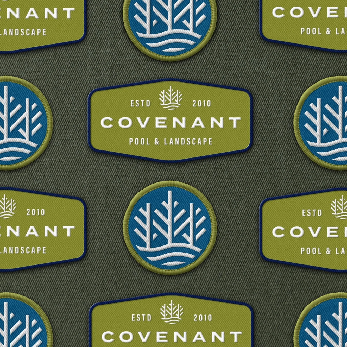
In their new kit, the distilled essentials of who Covenant is - clear blue water, textured grey stonework, and verdant green growth - all come together as if they had never been apart.More descriptive in less words is the goal. We moved Covenant to the fore with the simple sub-head Pool & Landscape to bring this crew closer to that one word association every enterprise is after.
We did some pruning around the name as well. A covenant is a pact, a contract, an agreement, a promise that binds us to one another. It’s biblical. It abides. It marks a new relationship. In a neighborhood, it’s how we agree to live with each other.
FLEET / SIGNAGE
The new mark is versatile, resilient, and unpretentious. Broken down and recombined in thoughtful ways with the new color palette, this visual identity easily scales down to business cards and up to their impressive work fleet. Turning down your leafy street there’s a flash of color, a bit of logo, an instant recognition, and the neighbors don’t even need to see the name to know who’s on the job.


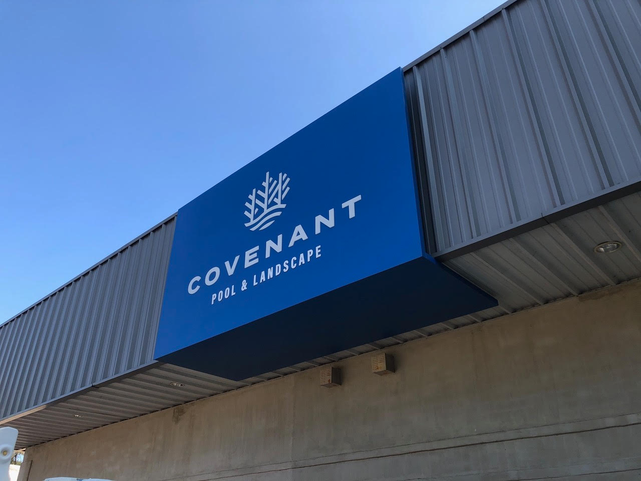
Our job isn’t finished until every touchpoint is just right. Installs like this one are often where we get to stretch our problem-solving chops with real-world applications.
At Covenant HQ we were dealing with an older light cabinet from the original signage on this exterior. It wasn’t large enough to hold our mark and lockup. The fix was this under-wrapped sign that could hold the whole mark and be back lit at night by the same old cabinet behind it. Elegant, great looking, and cheaper… here’s two signs for the price of less than one.
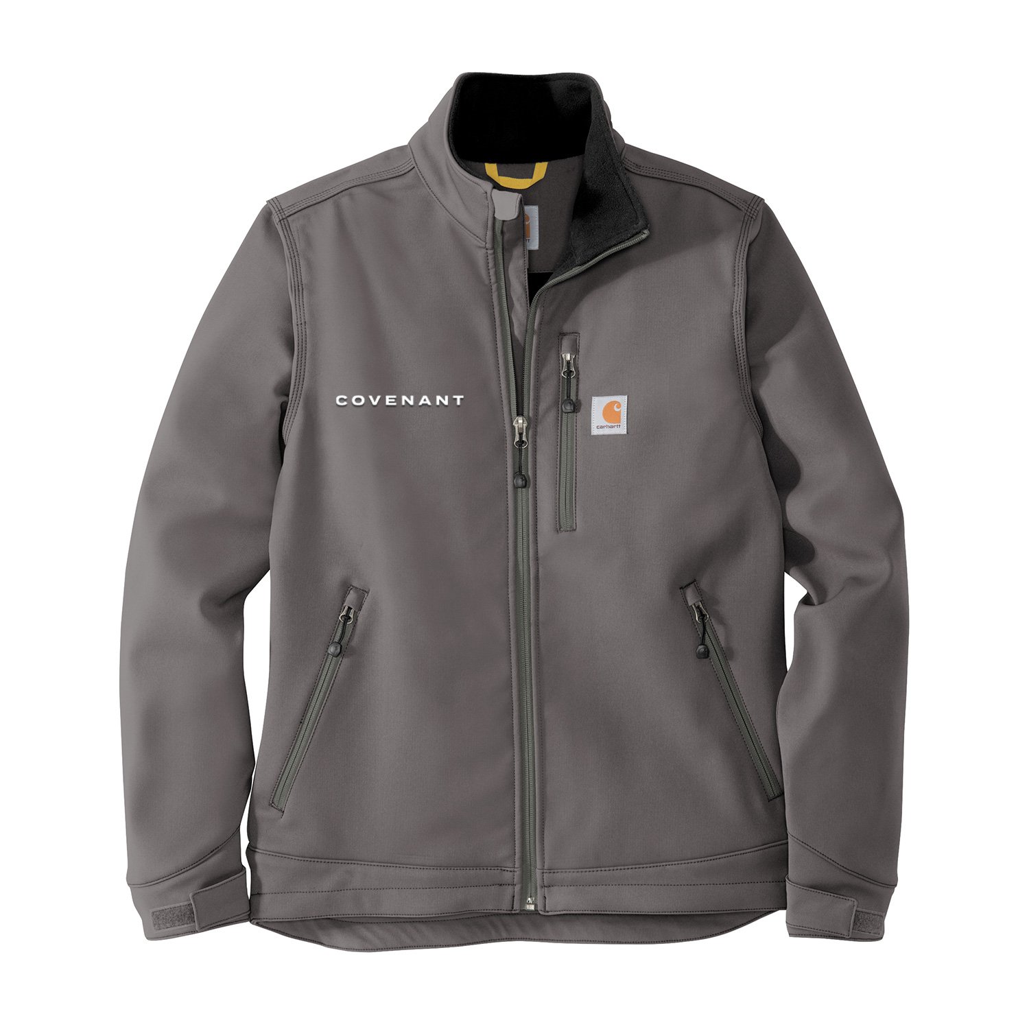
APPAREL


