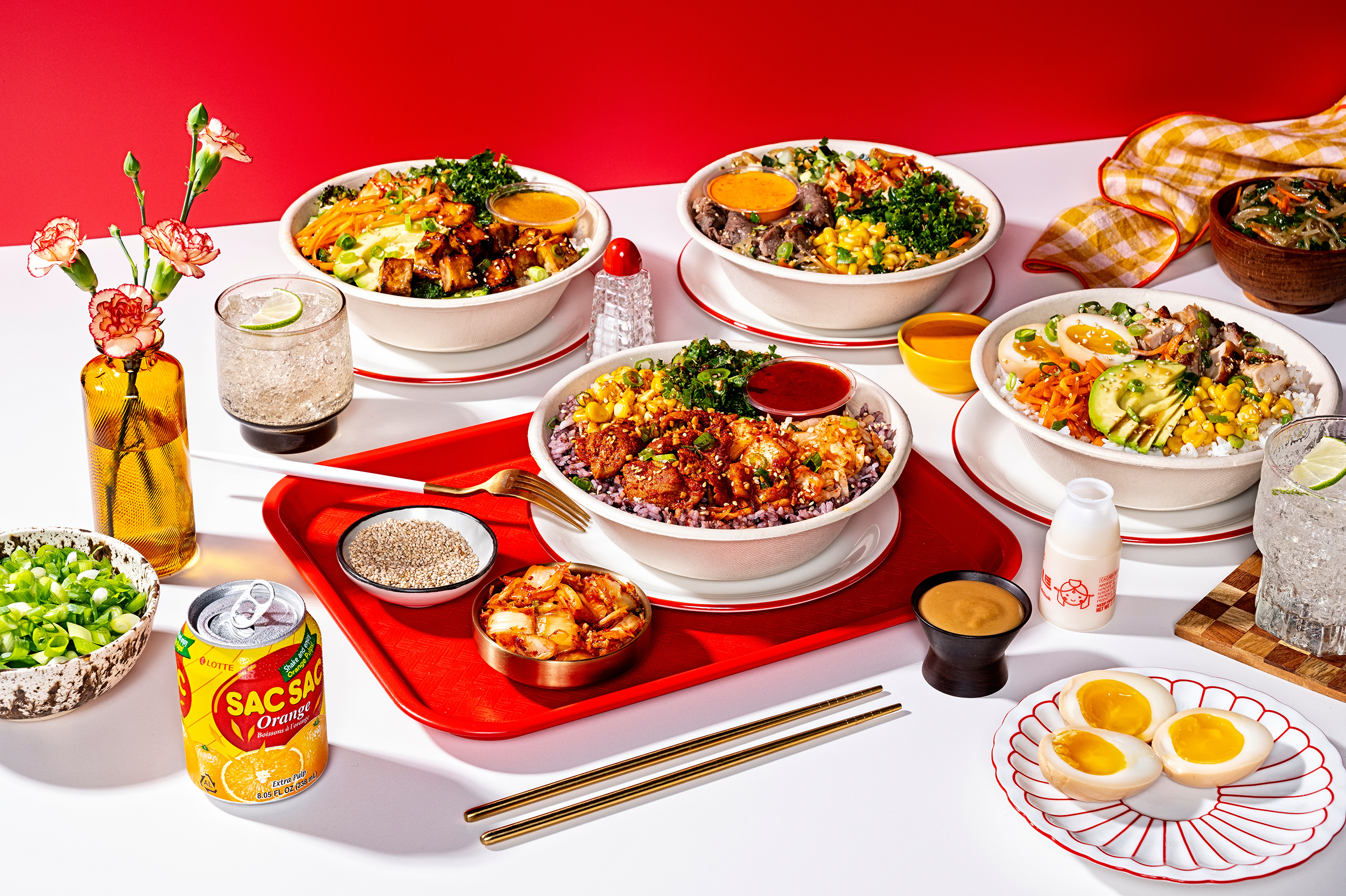
Respect the rice.
SEOUL SPICE
Have you heard the one about the concert percussionist with the National Symphony Orchestra who opens a banging Korean fast casual bowl joint in the heart of DC and then watches it explode into multiple locations and a PE bidding war?
When SeoulSpice founder/Kennedy Center rhythm section principal, Eric Shin decided it was time to start moving on a Federal level, he chose LFB to redesign his brand and kit them out with a playbook for new restaurants and a national footprint.
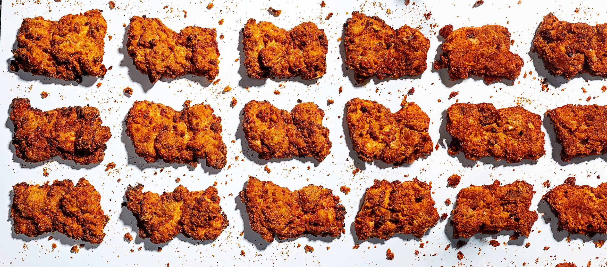
Super flavorful and naturally gluten free, the ENTIRE menu is made fresh daily at each of their restaurants.
With a deeply refined, custom kitchen and workflow design that enables a rapidly efficient and ventless entry into new stores, Seoul Spice is agile and primed for a wild growth curve in the next 5 years. We had to move quickly to build an innovative, modular art & storytelling system that could move at their pace.

Yes, please.
TYPOGRAPHY & PATTERNS
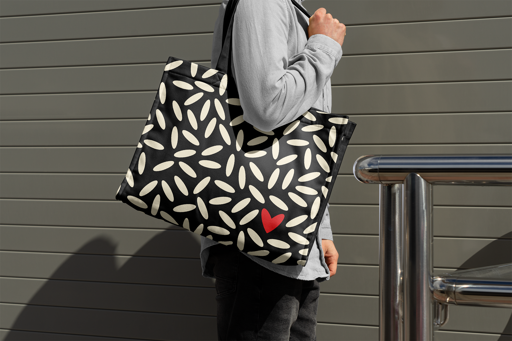
We went straight to the DNA for art inspo. Respect the Rice & Use Your Noodles. Rice is Everything. In Korean culture and in the fabulous traditions of the Shin family. Every kernel carries a nourished history of love, care, respect and family.

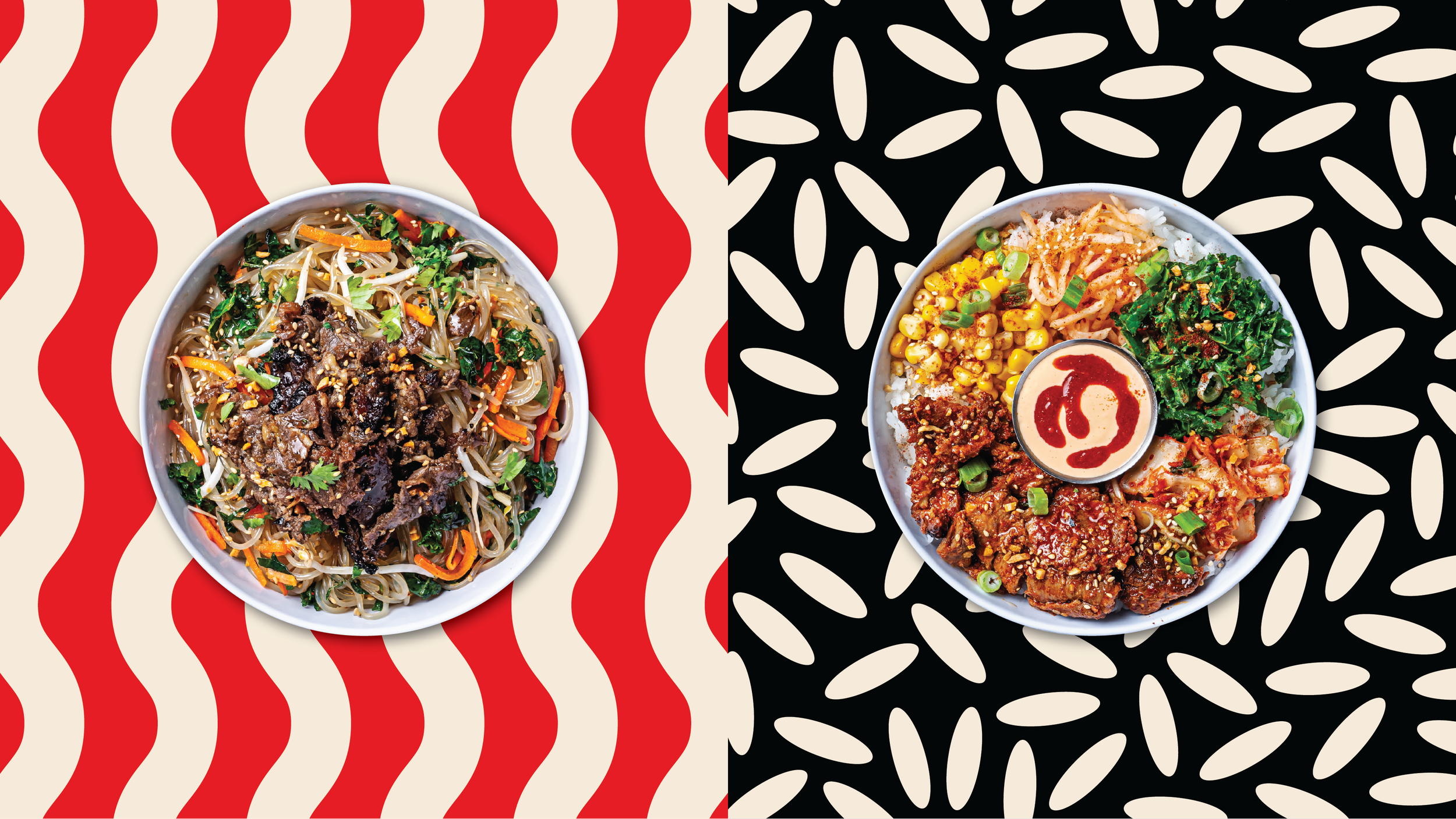
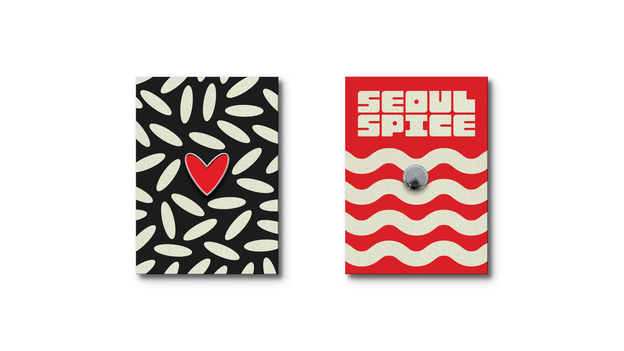
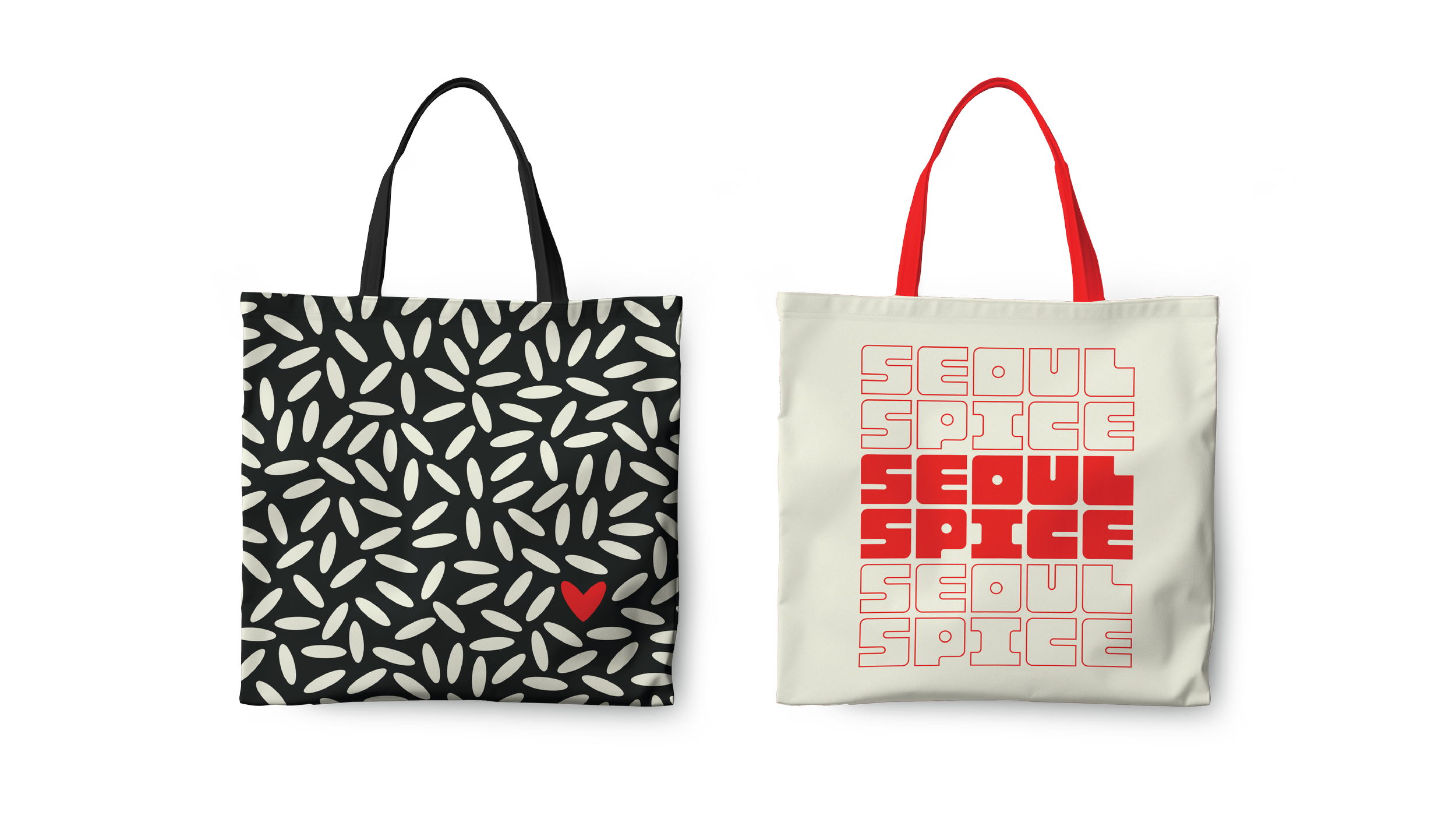
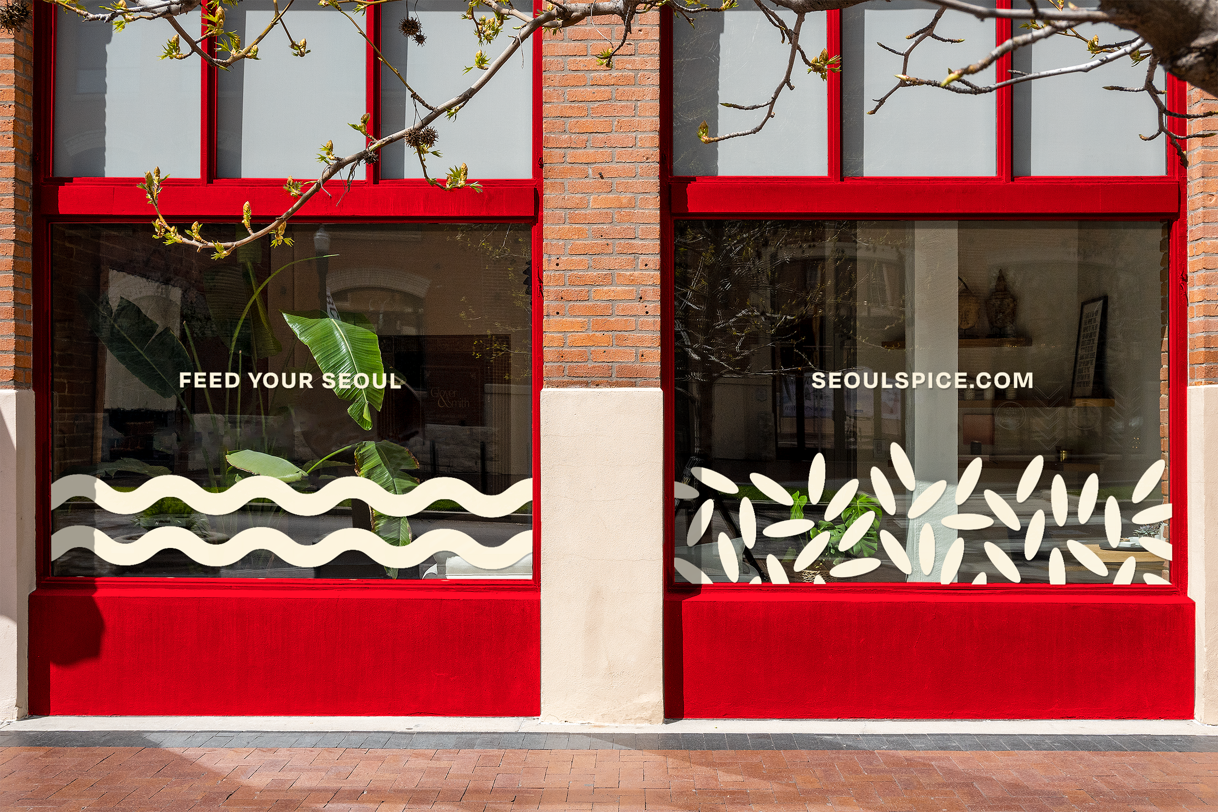
These Rice and Noodle patterns provide a playful landscape for brand art on the largest and smallest scales. At the heart of the brand, two grains of rice find each other and combine into our take on the iconic Korean fingerheart symbol.
ENVIRONMENT & OUT OF HOME
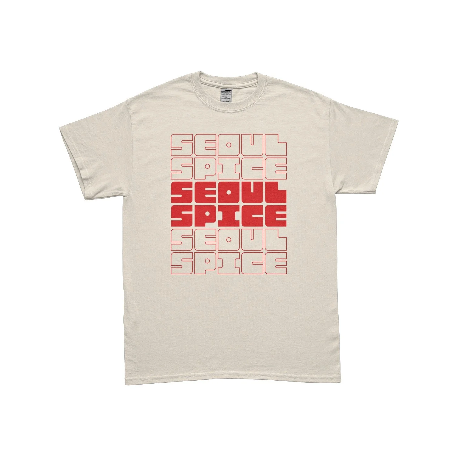
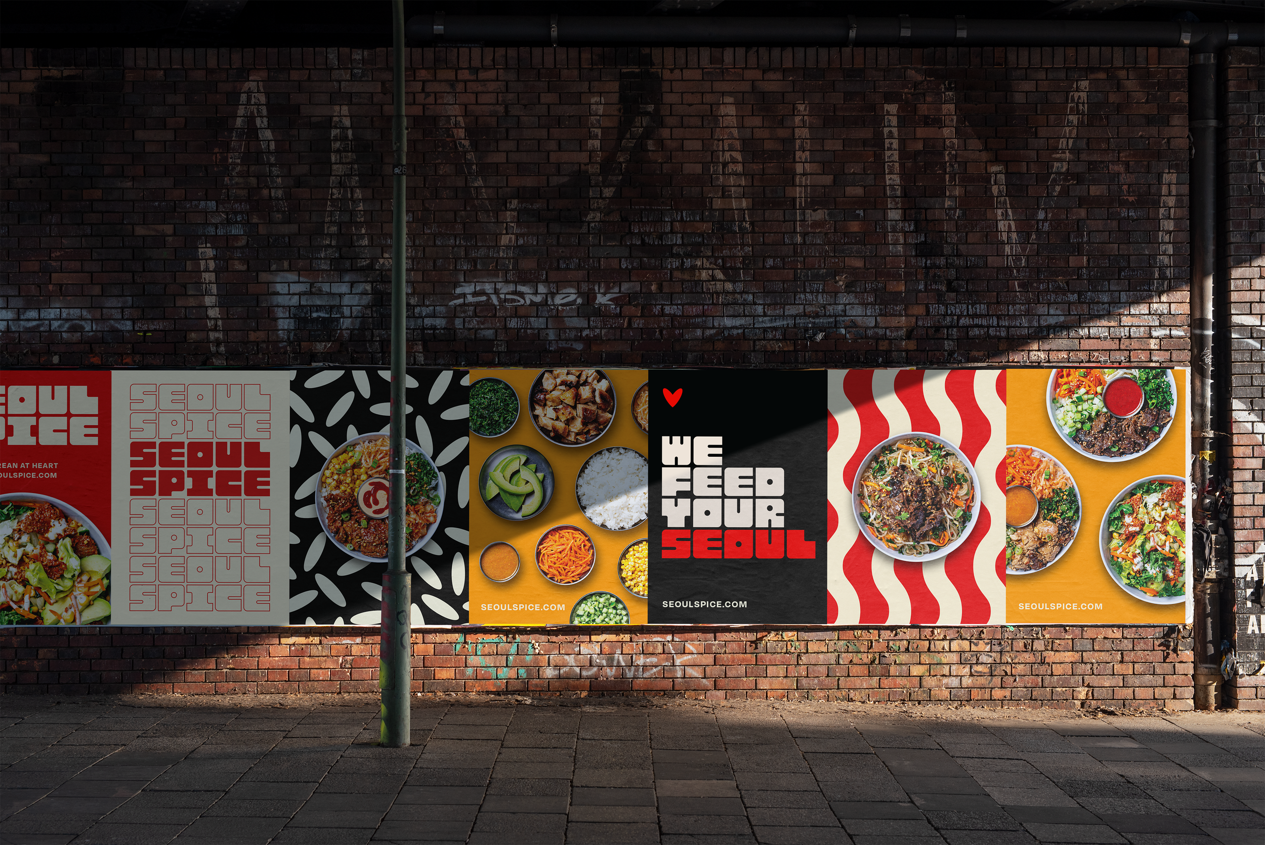
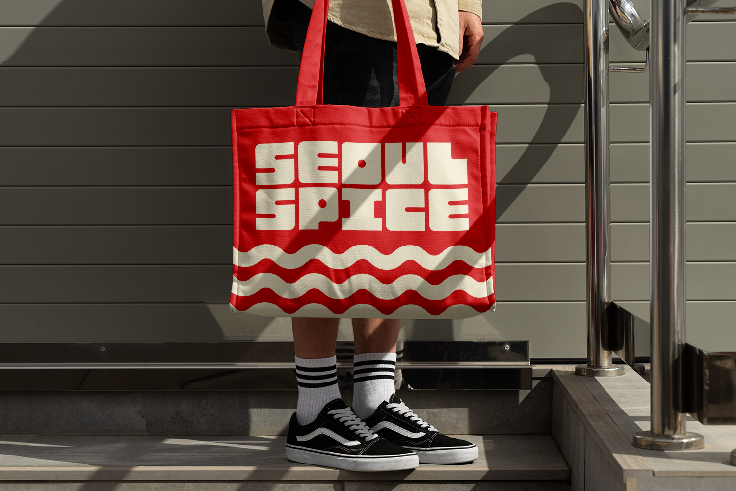
Chunky Spice is what we call the custom type system we built for SS. Each letter in the alphabet is the same size, cut and formed from the same square.
This choice created a uniquely artful stacking and and grouping pattern we could use anywhere from signage to menus to merch & collateral.
MERCH & APPAREL

Spice up
your style.
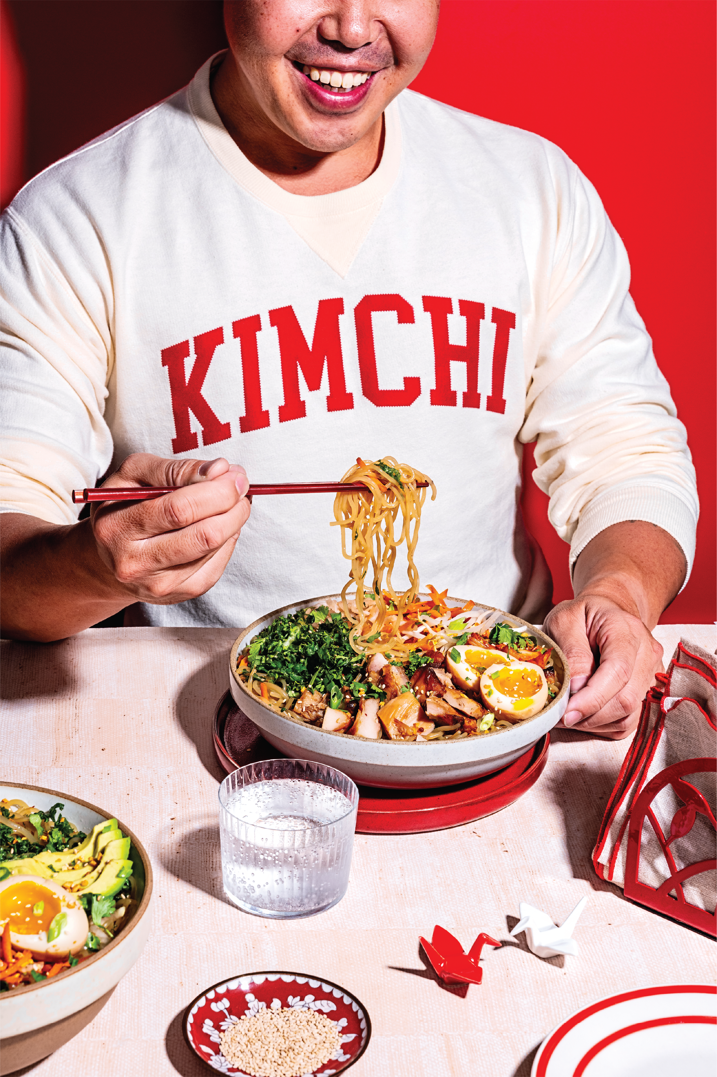
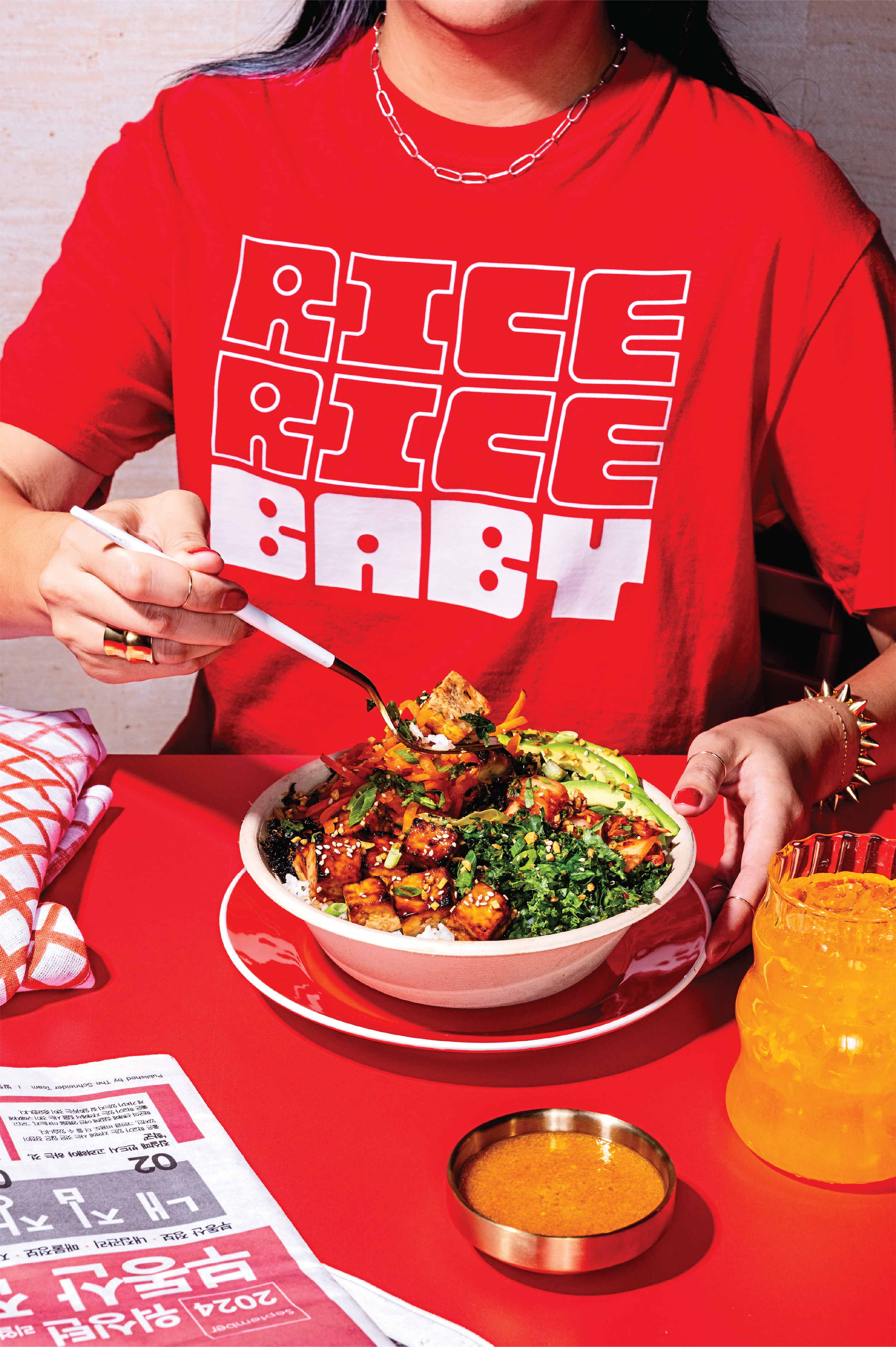
Brand Type, Art and Color can be deployed in variable, dynamic ways to carry the Seoul Spice story through any context.
PACKAGING & BRANDED ITEMS
MENU DESIGN
Our menu system design delivers art, options and easy education while you wait your turn in a Seoul Spice line.
