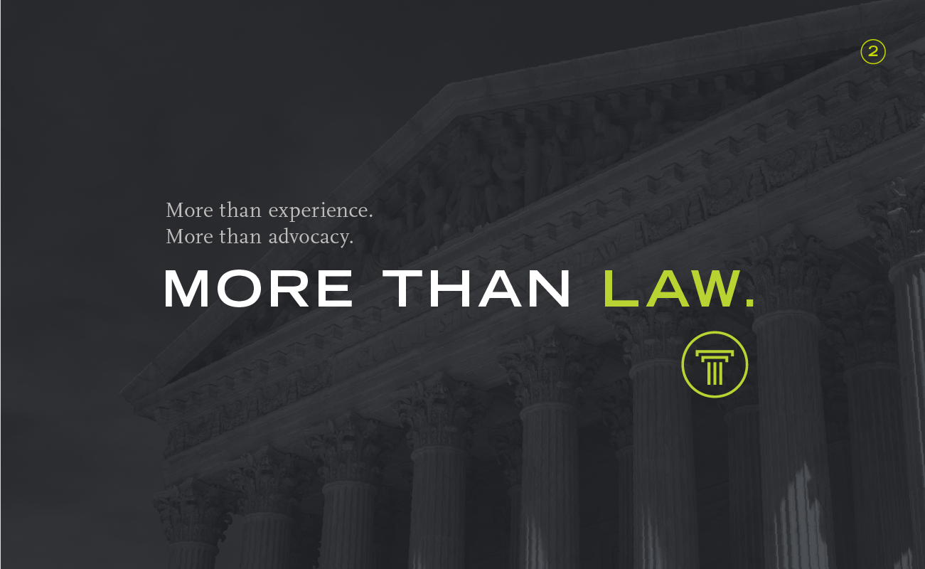
More than Law.
EVANS PETREE
Evans Petree is not simply a law firm— it is a collection of over 50 professionals with mastery in numerous facets of business litigation and consultation. But they had a problem.


Despite nearly a century of being a trusted fixture in Memphis law, their brand was unfocused and somewhat variable. Through face-to-face meetings with staff and offsite discovery, we determined not only what Evans Petree wanted their brand to be, but what brand they currently had— whether they knew it or not.
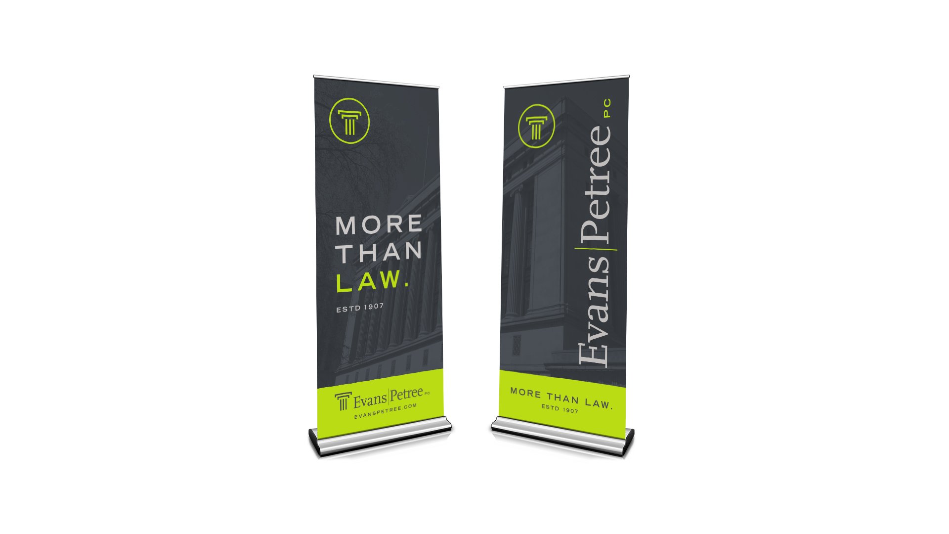
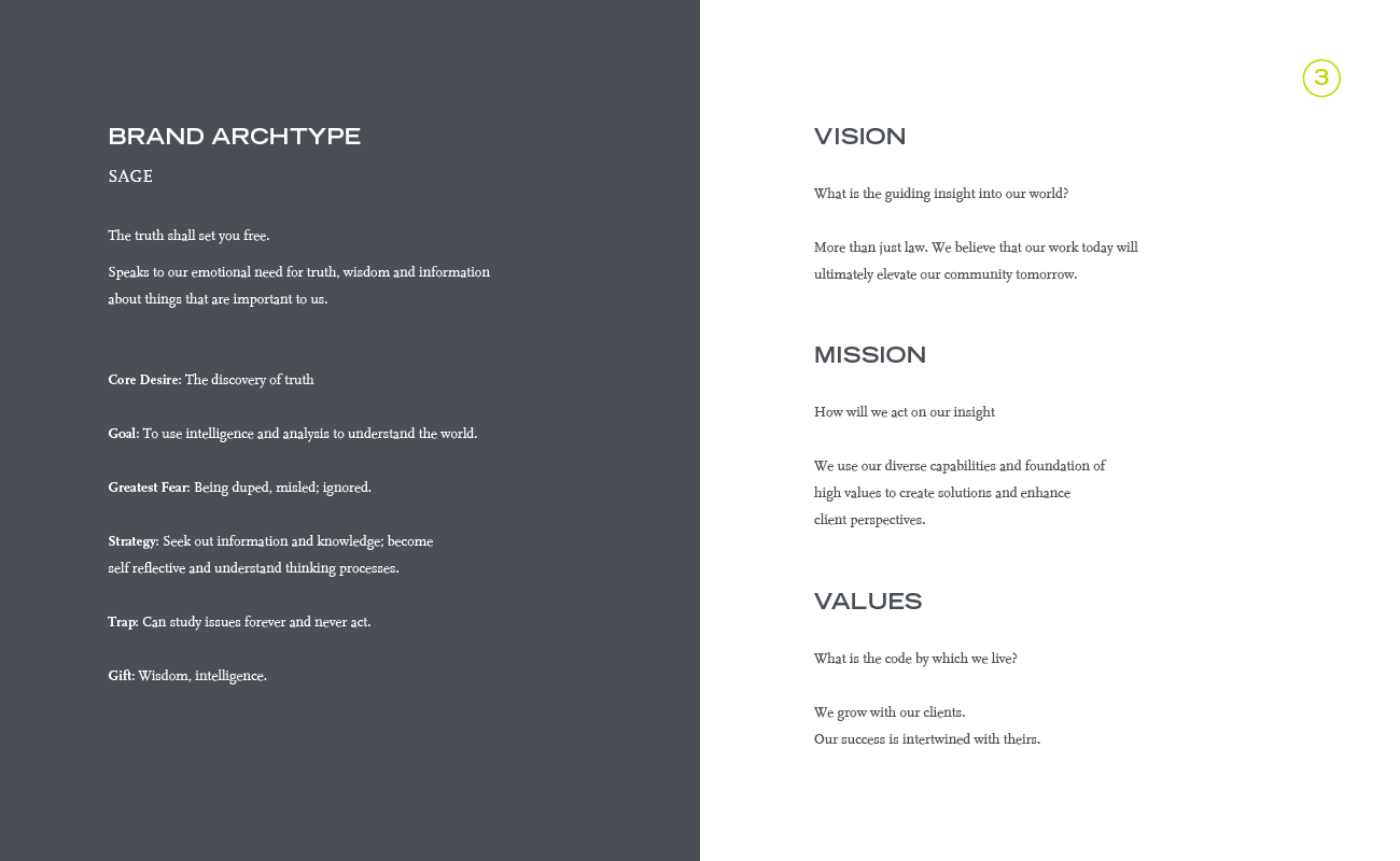
Archetypally, we determined that Evans Petree was a classic Sage brand— one that speaks to our inherent need for truth, wisdom, and guidance.
“Why do you do what you do?”
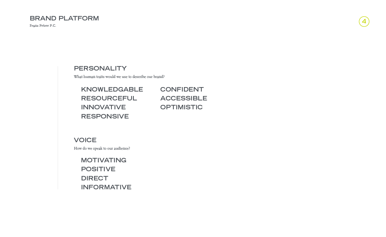
From this one question, we helped Evans Petree determine the guiding insight into their work and develop a voice that reflected the commonalities in their diverse areas of expertise, as well as their desire to connect with their clients as true partners.INTERACTIVE

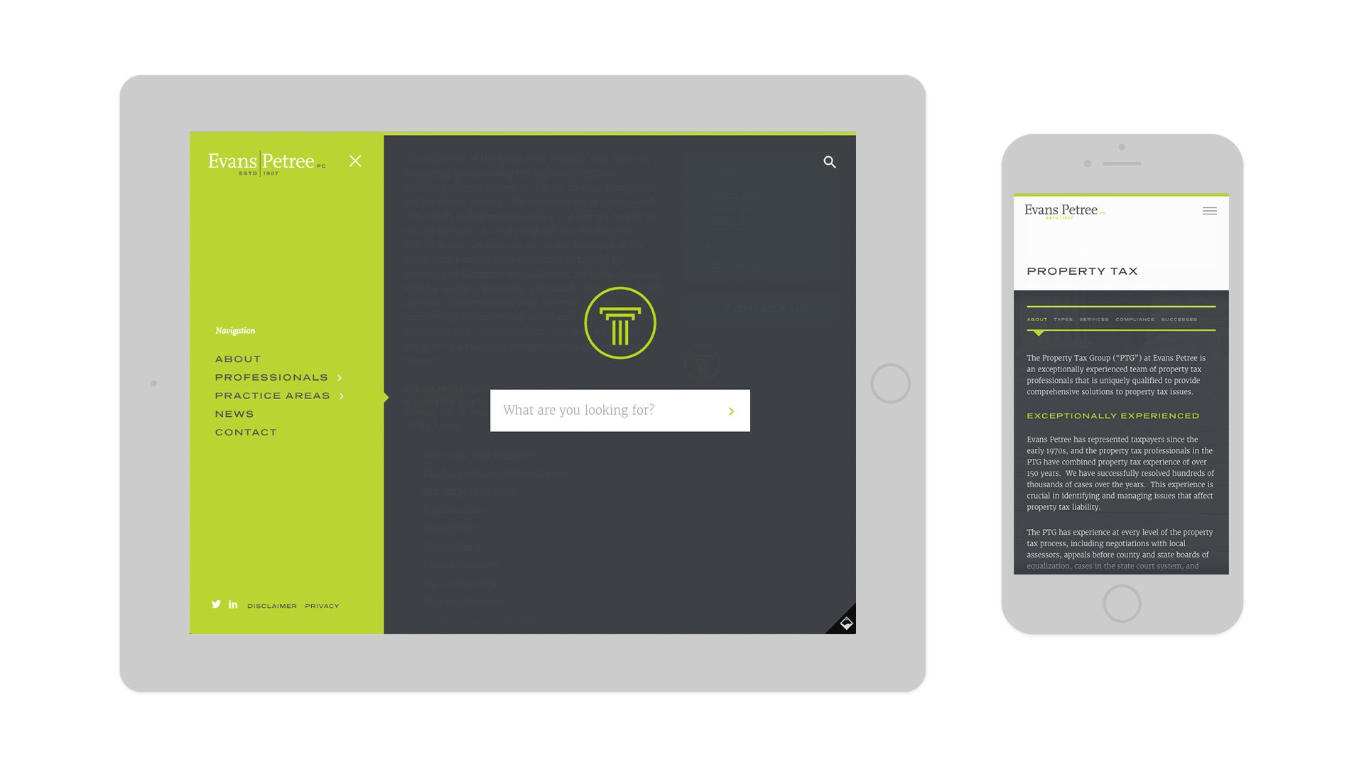
We crafted a specific user-experience to remove the unnecessary “fluff” of a typical law firm homepage: a prompt that funnels users directly to the information and contacts for their specific legal need.

This portal— flanked only by the new brand logo, identity, and tagline—allows the end-user to process the breadth and depth of Evans Petree’s client offerings easily and concisely.
After performing user case studies and analytics reviews, we realized most of the traffic flow on the Evans Petree website went directly to their Practice Areas page.

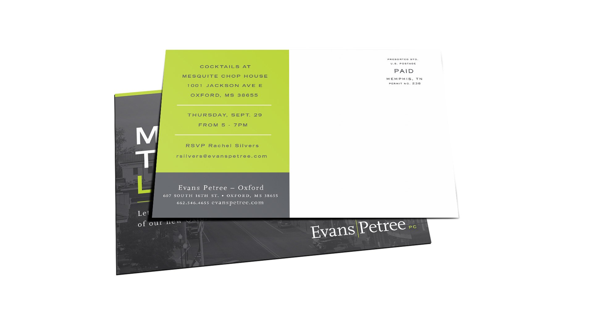
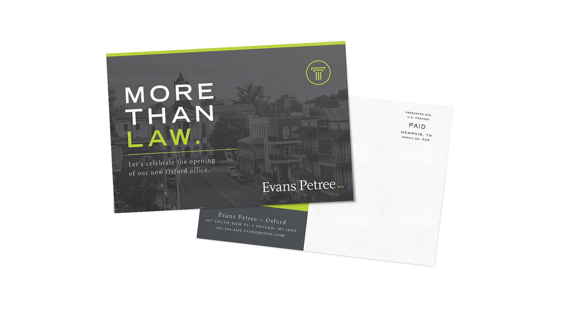
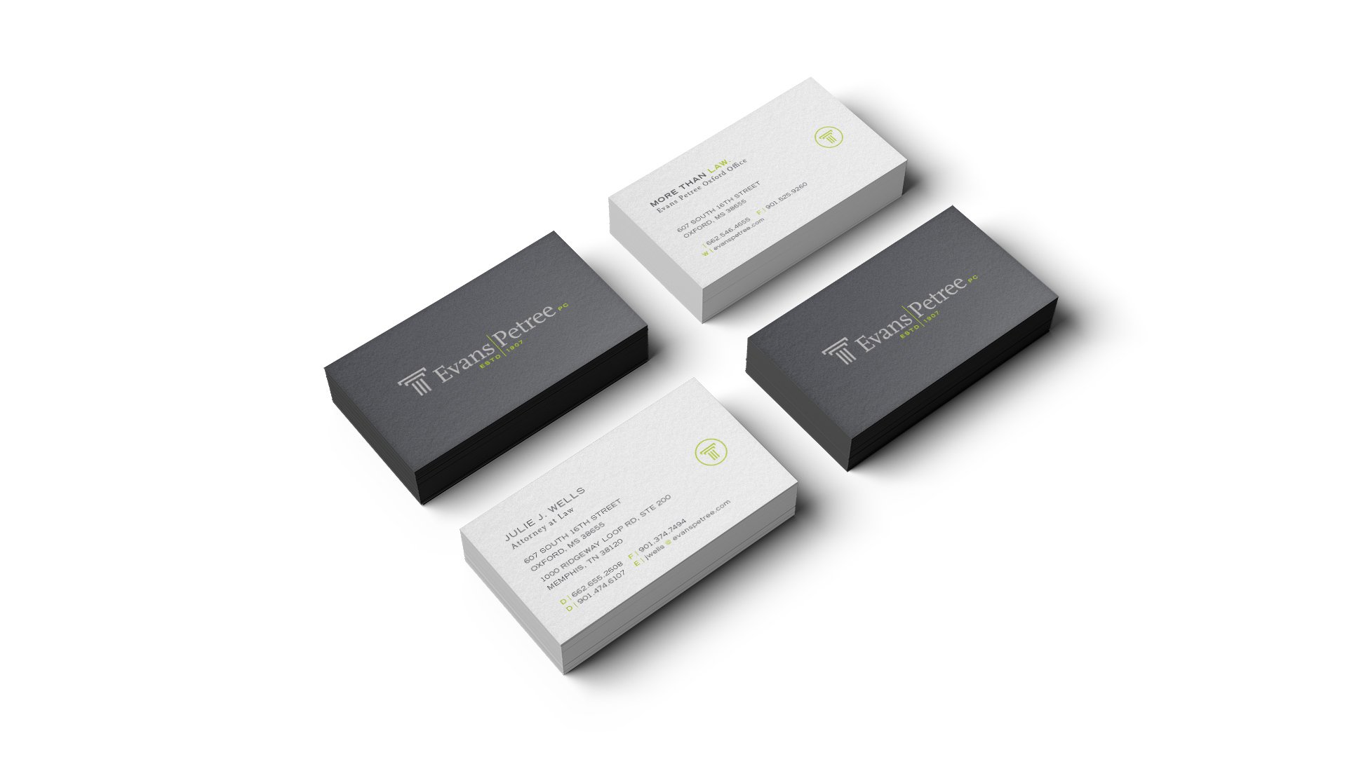
BRAND GUIDELINES
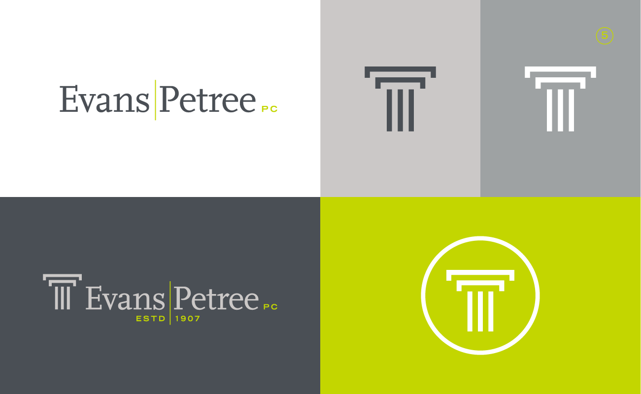
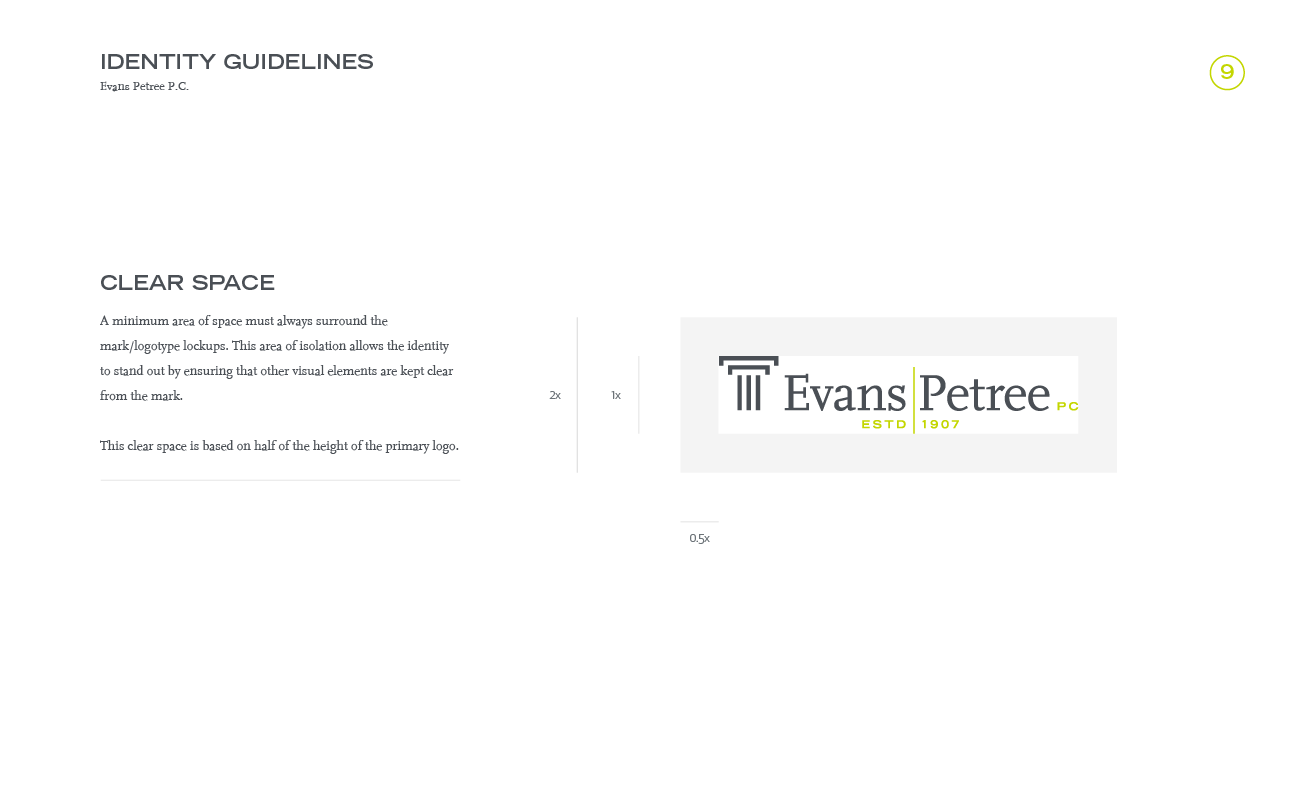
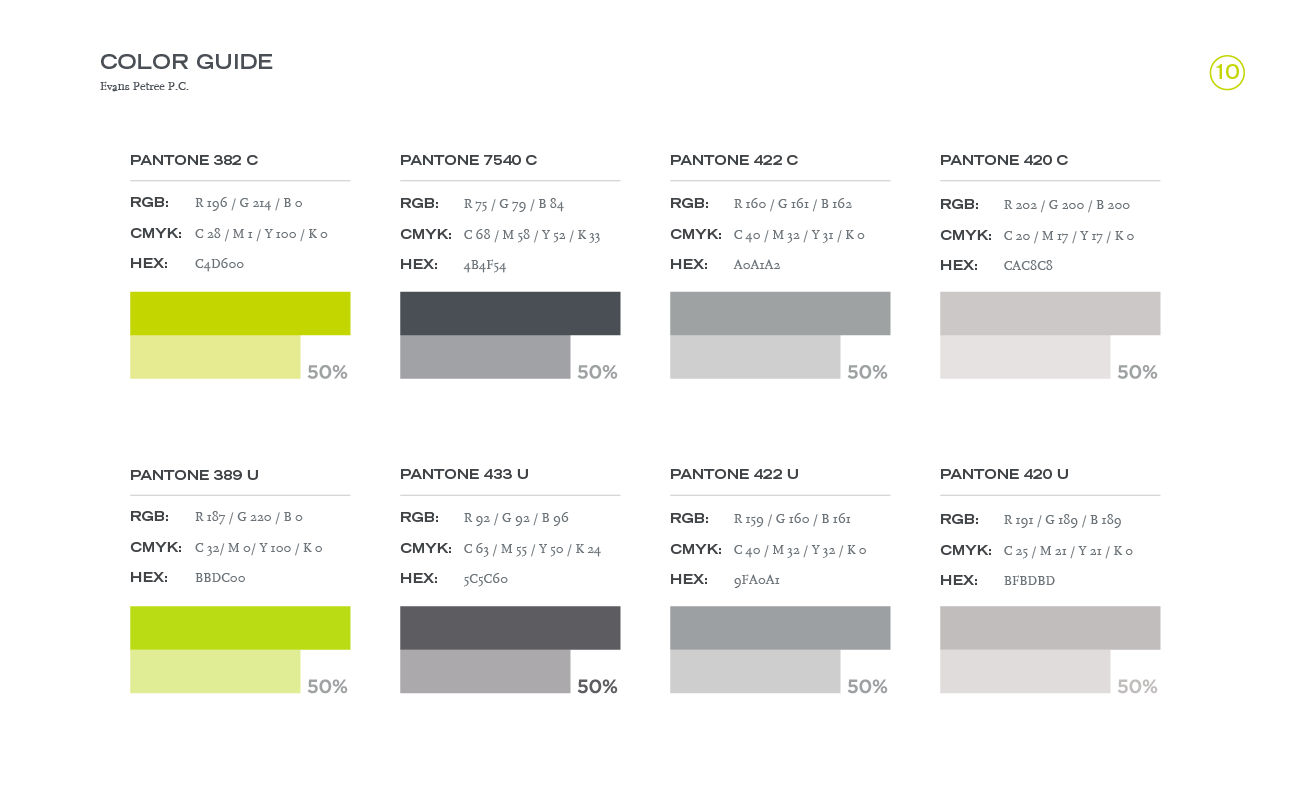
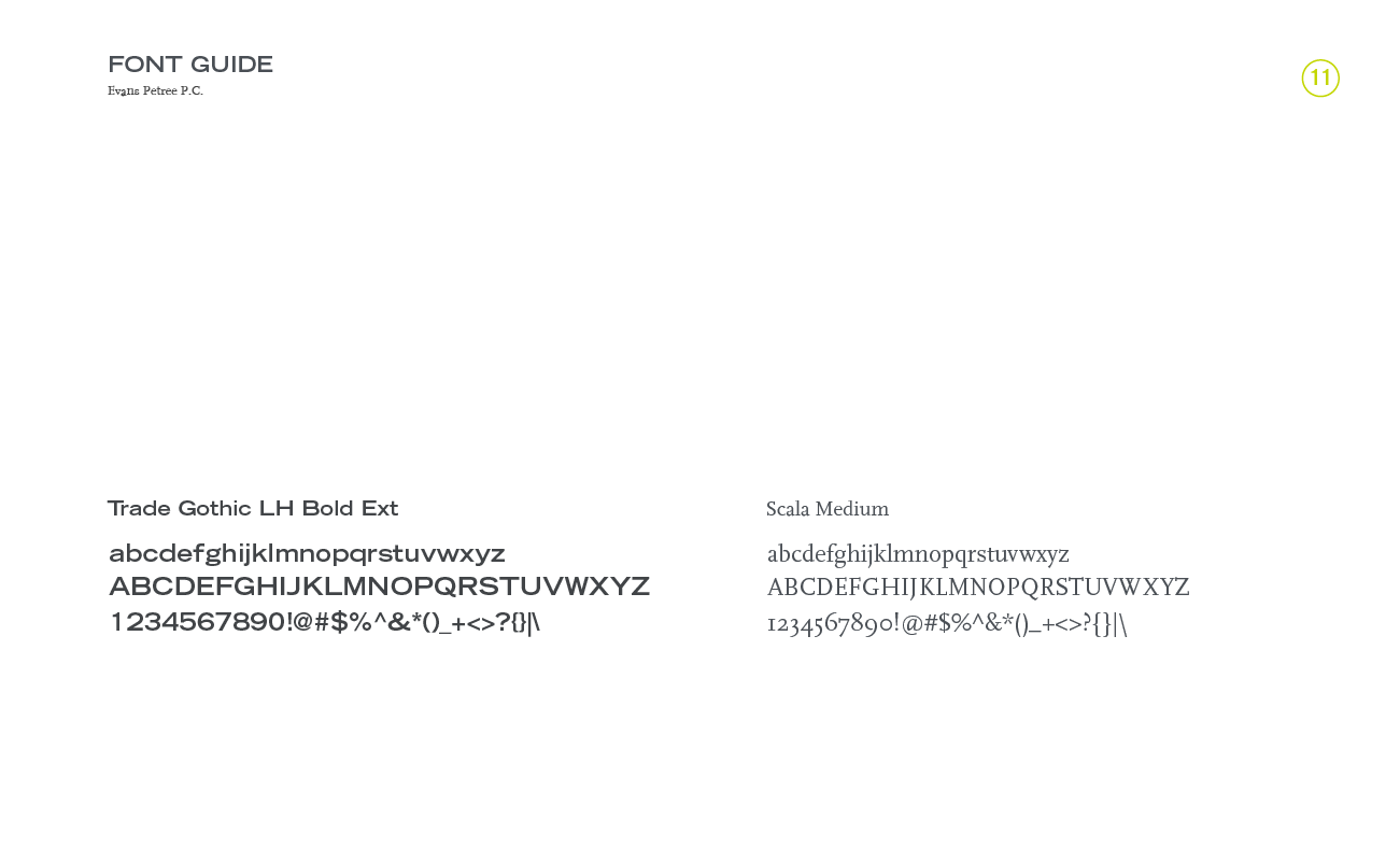
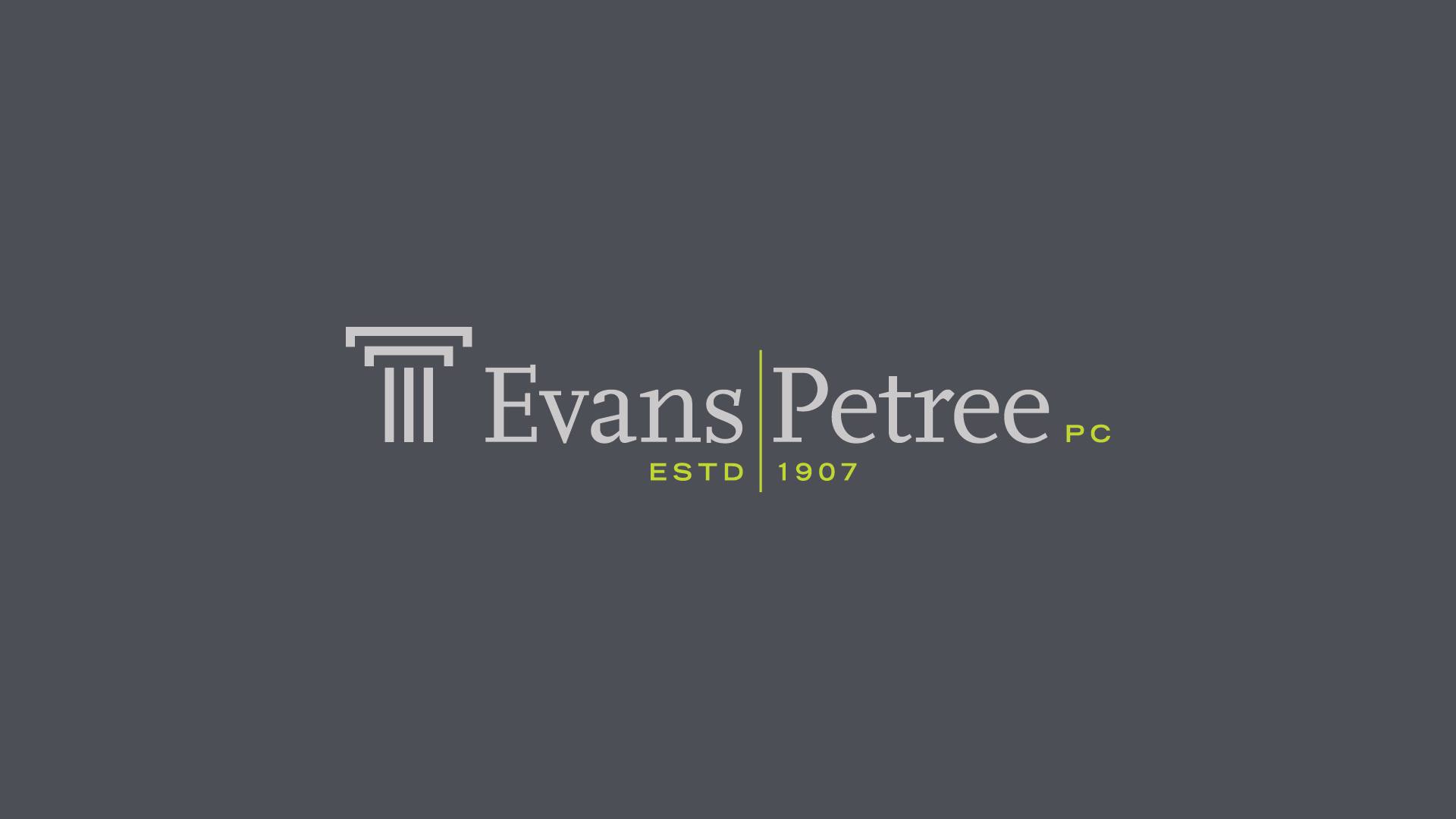
100 years of history with no consistent brand meant we had a clean slate when it came to art direction.
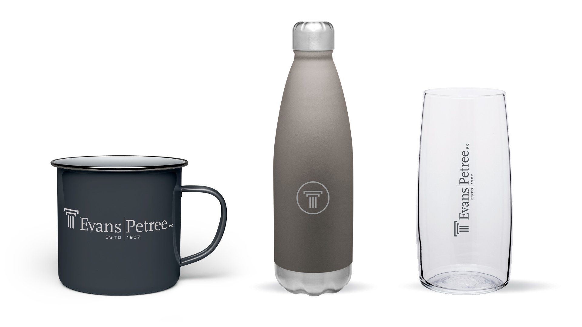
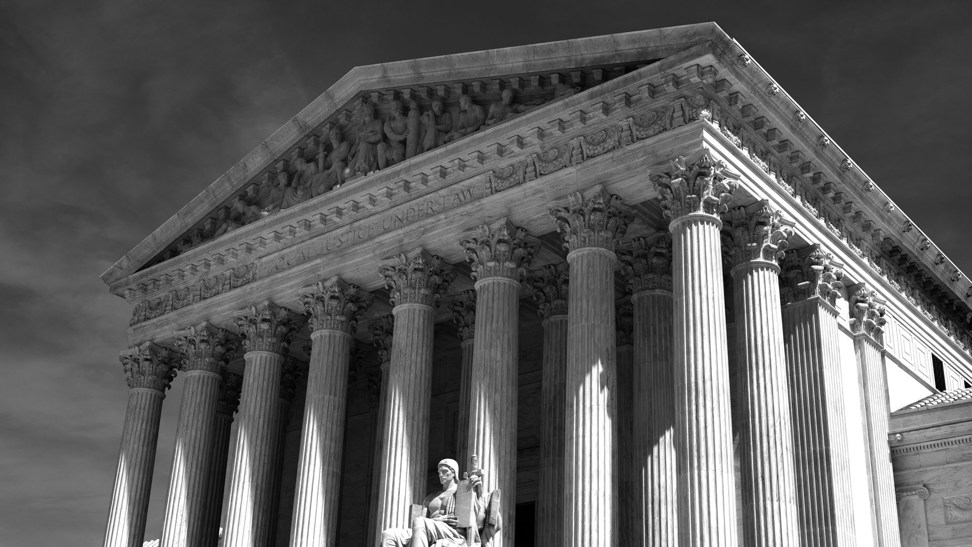
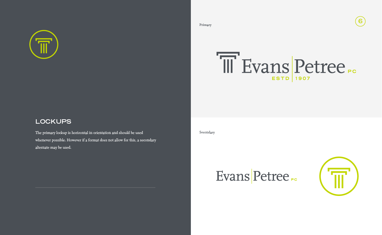
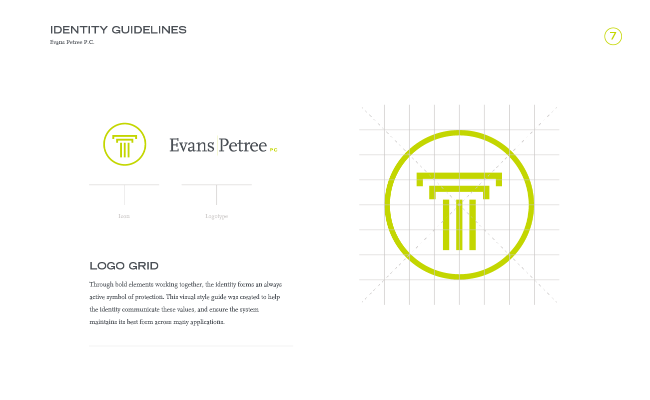
Evans Petree wanted modern and progressive, while retaining a traditional nod to the past. We responded with a timeless mark for their next 100 years, combining conventional column imagery with a contemporary interpretation of the letter E. The color palette reflects the balance that Evans Petree wanted to strike with their new brand: the grays indicating a solid foundation, like stone and concrete, and the vibrant green indicating youthful energy and vitality. Even the typeface selection— a classic slab serif, updated with clean, modern edges— spoke to the dual nature of their new brand.STATIONERY / COLLATERAL